
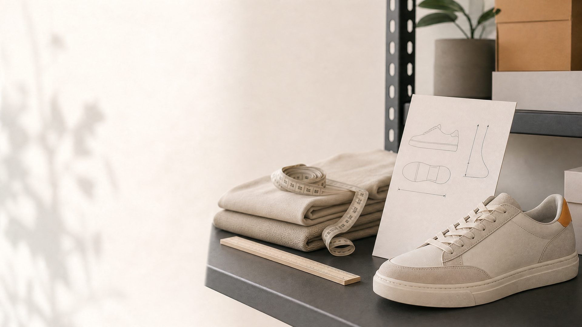
A size guide belongs where a shopper is deciding between variants, not on a hard-to-find policy page. When the information is easy to open, clearly labeled, and relevant to the product in view, it helps customers check fit without leaving the buying flow.
The best implementation depends on your catalog. One universal chart can work for a focused product range, while apparel, footwear, and products sold across regions often need product-specific guidance. This guide covers the information to prepare, a native Shopify approach, and a simpler button-based option.
Build the guide before you build the button
Start with information that will actually help someone choose. A useful size guide identifies the product type, the unit of measurement, and the point of measurement. It should distinguish body measurements from finished-garment measurements when that distinction matters. Include a short note about fit only when it reflects the product, such as whether a style is designed for a close or relaxed fit.
For a catalog with multiple sizing systems, label each system clearly. Do not rely on an unlabeled row of numbers or a generic image that applies equally poorly to every product. If a chart changes by collection, material, age group, or cut, prepare separate pages or source materials before adding a single sitewide button.
Choose the right level of specificity
Use one guide when the measurements are genuinely shared. Create separate guides when shoppers would otherwise need to guess which chart applies. Common examples include men’s and women’s sizing, shoes and apparel, adult and children’s products, or different supplier measurement systems.
Specificity matters at the product level. A shopper looking at a dress should see the dress chart - not a general page that requires more searching. The goal is fewer questions between product selection and checkout, not merely adding another feature to the page.
Use Shopify’s native page-reference approach
Shopify documents a native method for a size-chart pop-up using a product page-reference metafield and a pop-up block in the theme editor. According to Shopify’s step-by-step guide, the workflow is: create a product metafield that references one page, create or customize a product template, add a pop-up block, create the chart page, and then connect the appropriate page to individual products.
This route is useful when your theme supports dynamic sources and you want product-level page references. Shopify notes that theme support matters: a vintage theme or a theme without the right dynamic-source support can require additional theme work. It also warns that a pop-up link can remain visible but open blank when the referenced page has not been assigned, so test an assigned and unassigned product before rolling the template out.
Place and label the button clearly
Put the size-guide trigger near the variant selector, especially where a shopper chooses size. “Size guide” is usually clearer than clever copy. If your product needs an additional measurement resource, use labels that name the content directly, such as “Fit notes” or “Garment measurements.”
A link or button should be easy to tap on a phone and should not push the Add to Cart button far down the page. Keep the interaction lightweight: the shopper should be able to open the guide, compare it with the selected size, and return to the same decision point.
Test the guides customers will actually see
Open each chart on desktop and mobile. Check that images and tables remain legible, that units are consistent, and that a product uses the correct guide. Test the path with a product that has a guide, a product that should not show one, and a product whose size variants are sold out. If you serve several markets, make sure the available units and conversion notes make sense for the intended audience.
Use a dedicated button when you want a faster storefront workflow
For merchants who prefer a ready-made storefront control, BL Size Chart Button provides a Shopify product-page path to sizing information without requiring a custom button build. Visit the product page to review the available setup and the linked marketplace installation route.
A concise launch checklist
- Each chart identifies the relevant product type and measurement unit.
- Products that need different charts have separate, relevant sources.
- The button sits close to size selection and remains usable on mobile.
- Every visible button opens useful content; no product has a blank pop-up.
- At least one real product page is reviewed after publishing.
A size guide should reduce uncertainty, not add a detour. If a dedicated storefront button fits your workflow, see BL Size Chart Button for Shopify and install it through the marketplace option shown there.